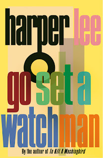
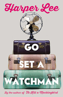
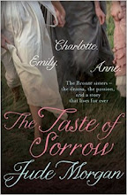
Personally, I prefer the American design. It seems relevant - the bird on the front of the UK edition harks too obviously back to To Kill a Mockingbird. There is no mention of a bird in Go Set a Watchman. Call me literal...
However, here are some of the designs that were rejected. I like to consider the conversations that were had about each.
"Nah, looks too much like a Tony Parsons novel."
"Definitely not. Too chick-lit. Looks like something on sale in an airport."
"Haruki Murakami?"
"Is it 1946? Are we publishing this before it was even written? Is it a Noir thriller? I don't think so."
"Yawn. We do want to sell a few, you know."
"You've taken the "watch" bit too literally..."
"Enough with the cartoon women already."
"Finally, we're getting close. But research shows that Brits like orange books, so change that for the UK, and Americans prefer railway lines to birds, so change that for the USA. There, both markets covered. Job done."


No comments:
Post a Comment